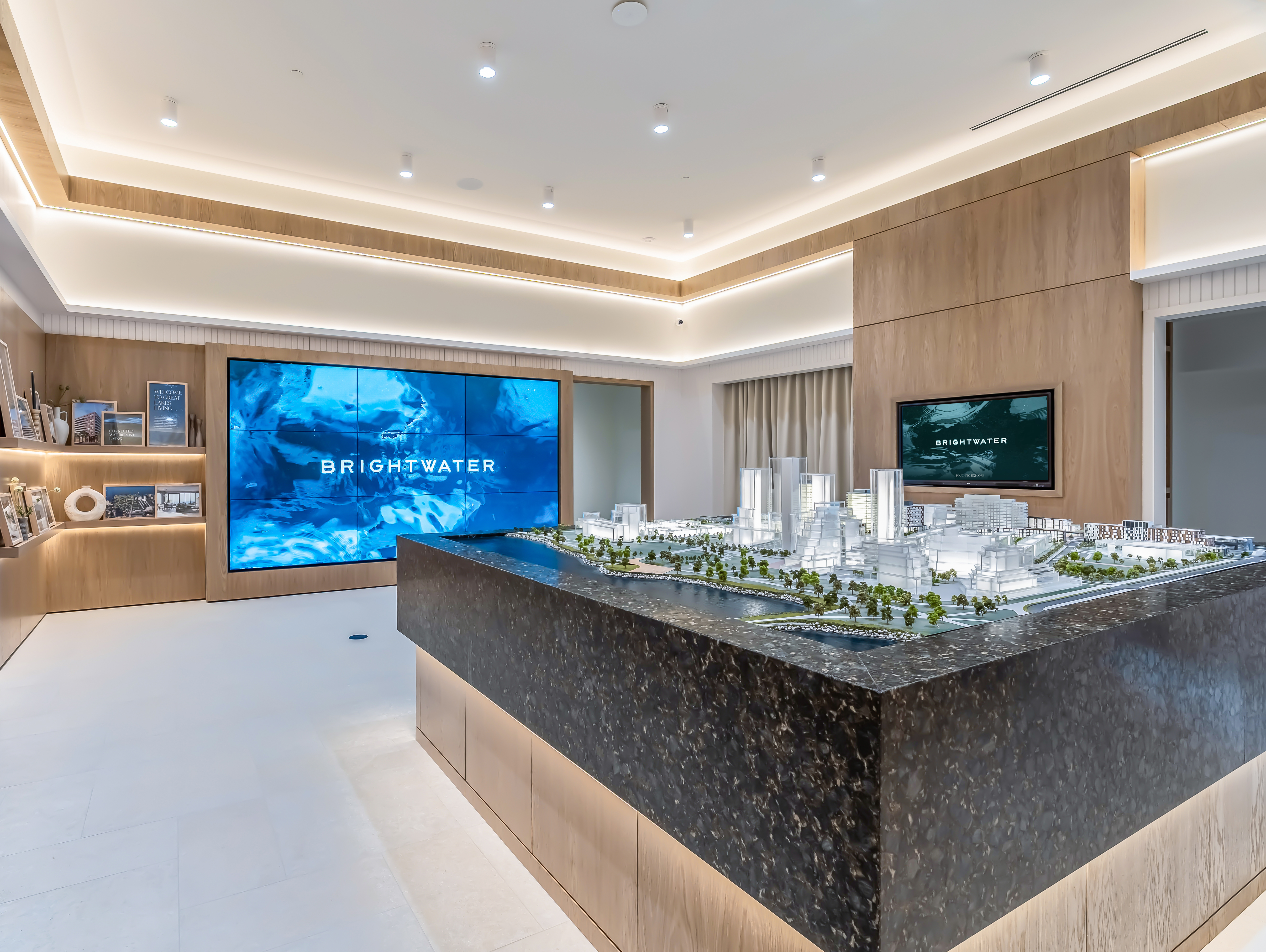
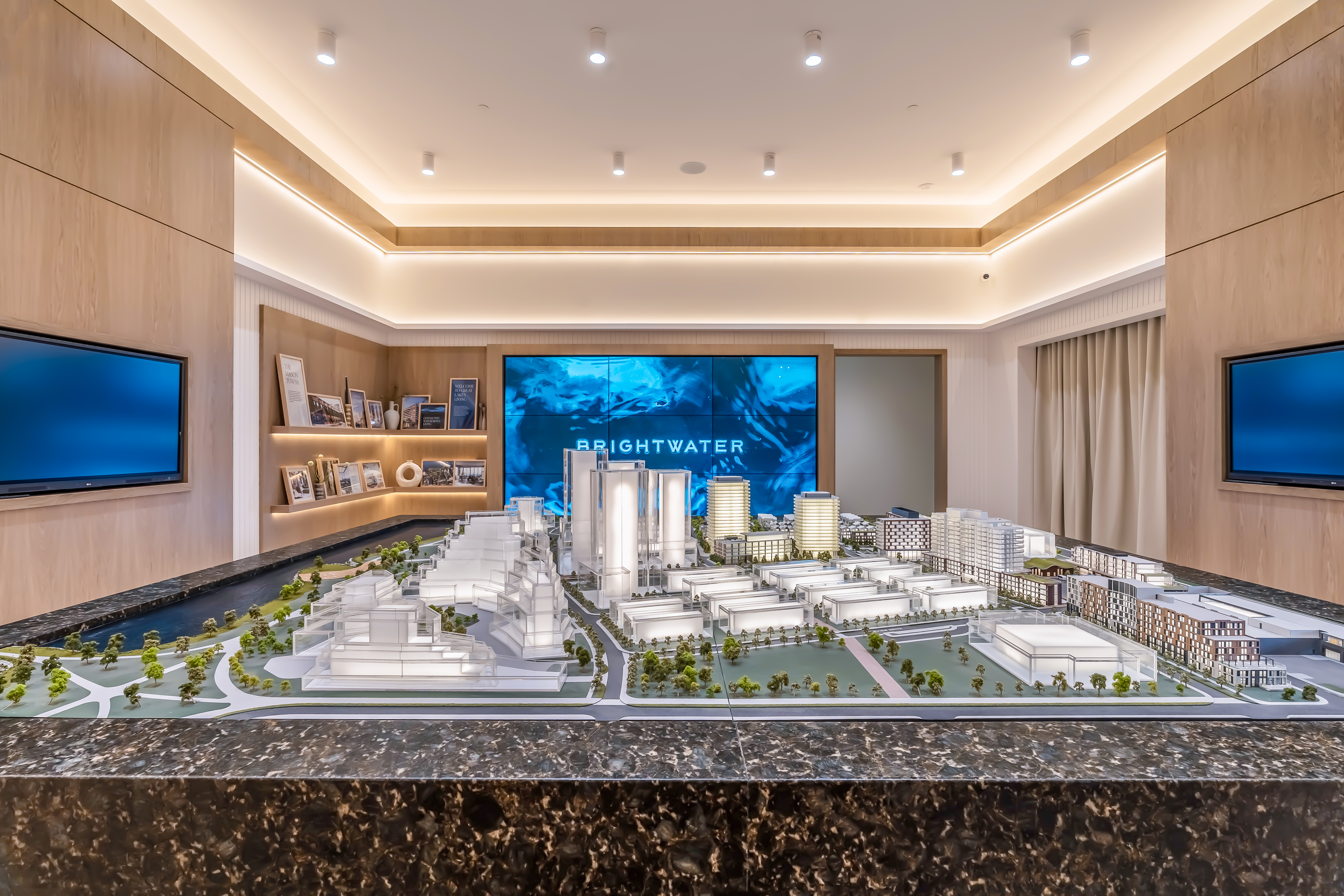
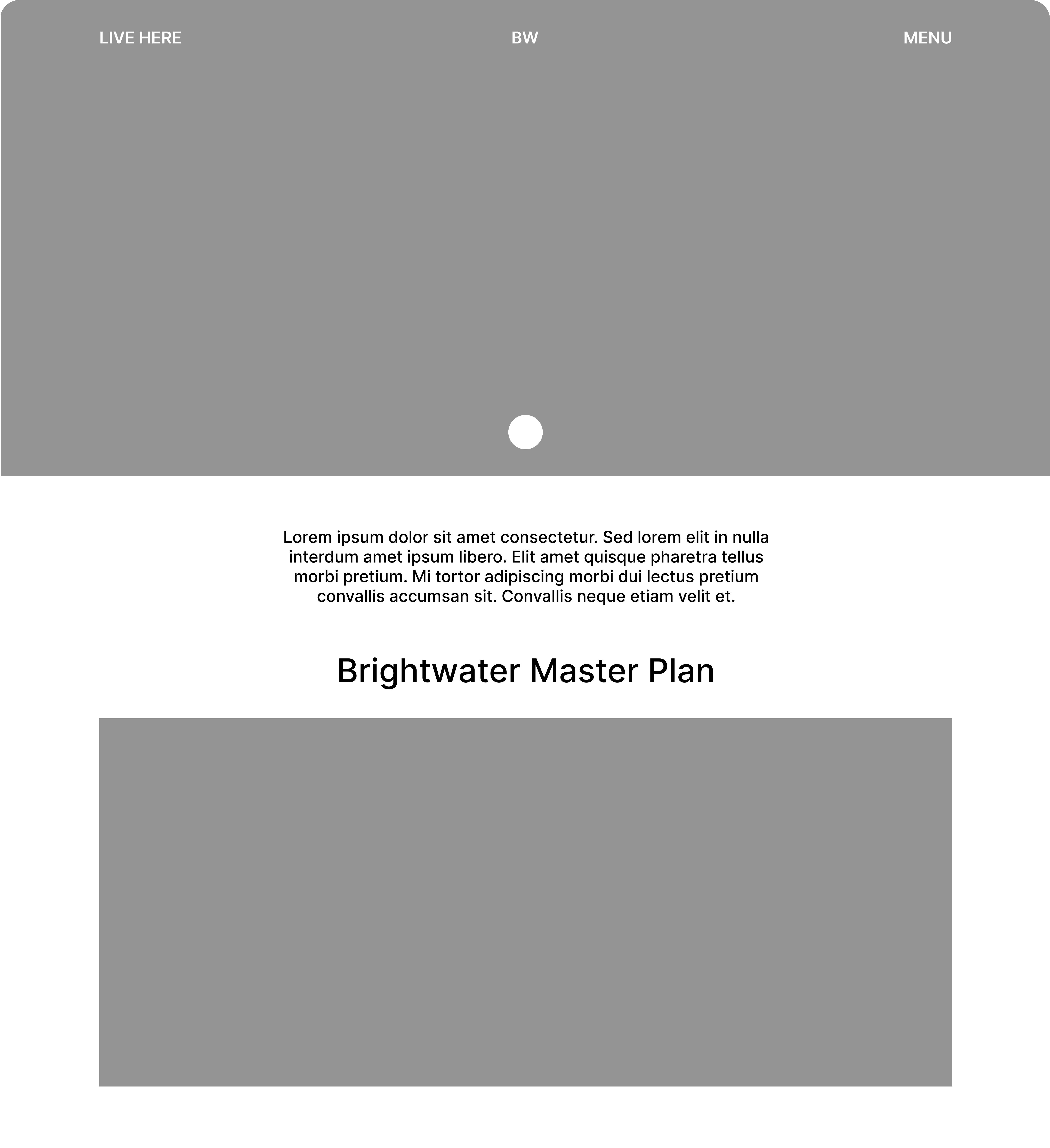
Brightwater
An interactive sales kiosk for a 72-acre waterfront community.
Year
2025
Status
Live — Brightwater Experience Centre, Port Credit
Role
Sole Product Designer
Tools
Figma, Adobe XD
Buyers were making $700K+ purchase decisions inside a kiosk that couldn't maintain spatial orientation. Conversations stalled, comparisons broke down, and sales teams repeatedly had to restart explanations.
This wasn't a content problem — it was a navigation and mental model problem. I redesigned the browsing experience to preserve spatial continuity, support live conversations, and help buyers make confident decisions in real time.
Context
A flagship development with an invisible future.
Brightwater is a multi-phase development consisting of 4,000 homes, multiple buildings, shared amenities, retail spaces, and waterfront infrastructure. At launch, most of this didn't physically exist yet — making it difficult for buyers to visualize the full experience of living there.
This created a critical gap in the sales process: buyers needed to make high-stakes decisions based on fragmented information and imagination rather than lived experience.
The sales team needed a tool that could translate an unfinished vision into something tangible and understandable.
My Role
End-to-end ownership. No design lead above me.
I owned this project end-to-end — from field observation to architecture design to final implementation. I worked directly with sales stakeholders to identify friction points, defined the information structure, designed every interface, and partnered with third-party developers through build and QA to ensure fidelity at launch.
Problem
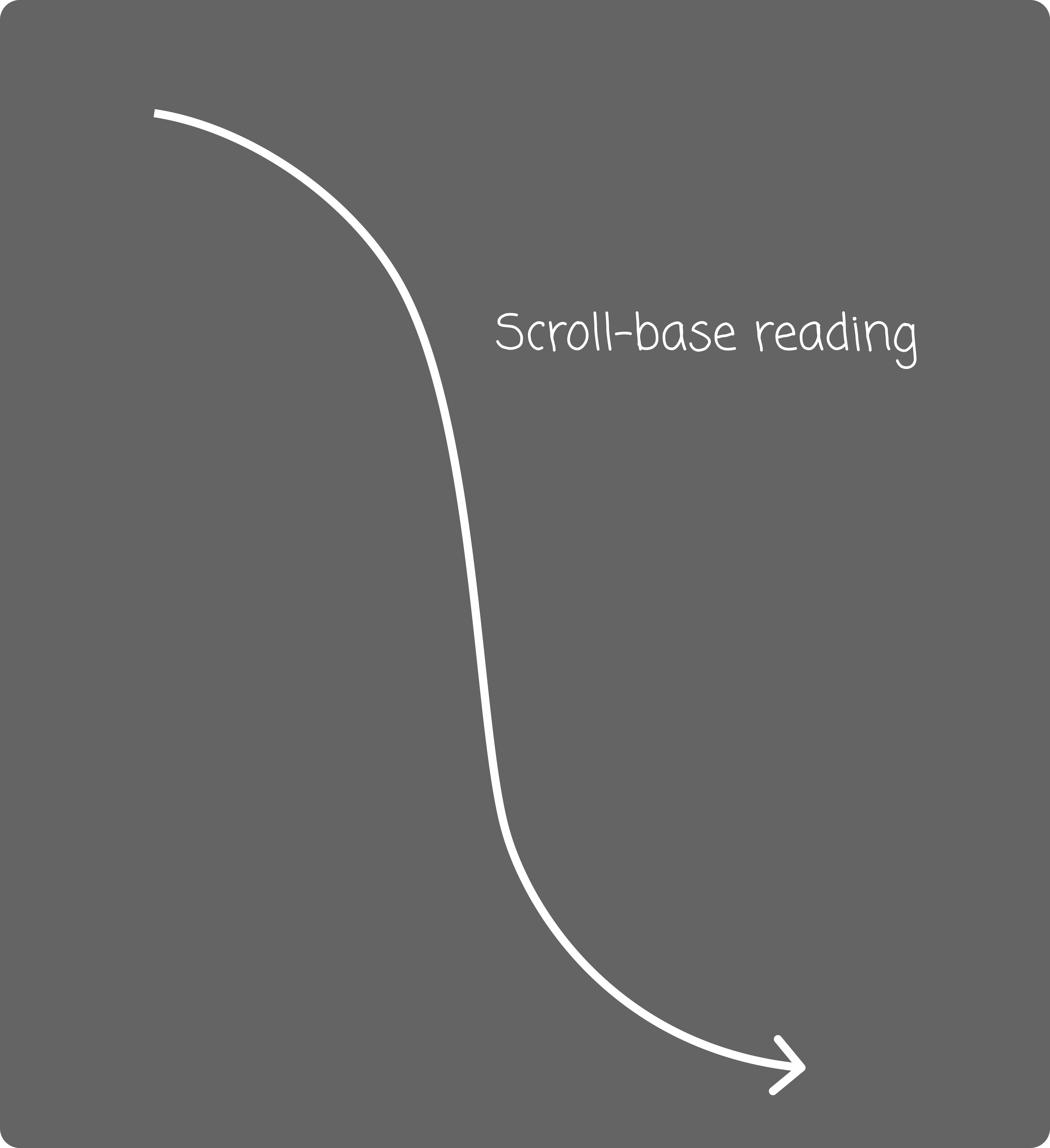
This wasn't an information problem — it was an orientation problem.
Buyers weren't struggling to find information — they were struggling to stay oriented.
Each building contained multiple unit types, and navigation followed a traditional vertical browsing model. As buyers moved between sections, they lost context and needed repeated assistance to reorient themselves.
In a sales environment where conversations happen live, hesitation slows momentum. Every moment spent navigating instead of discussing units weakened the flow of the interaction.
The real challenge was not access — it was orientation.
How Might We
Design a single, coherent experience that orients buyers spatially and emotionally before asking them to evaluate individual units — and that serves both self-guided exploration and sales-rep-led conversation?
Key Decision
Choosing a Navigation Model.
Early exploration revealed two viable navigation approaches: a vertical browsing model proposed by a third-party vendor, and a horizontal navigation model developed internally.
Third-Party Proposal
Vertical Browsing
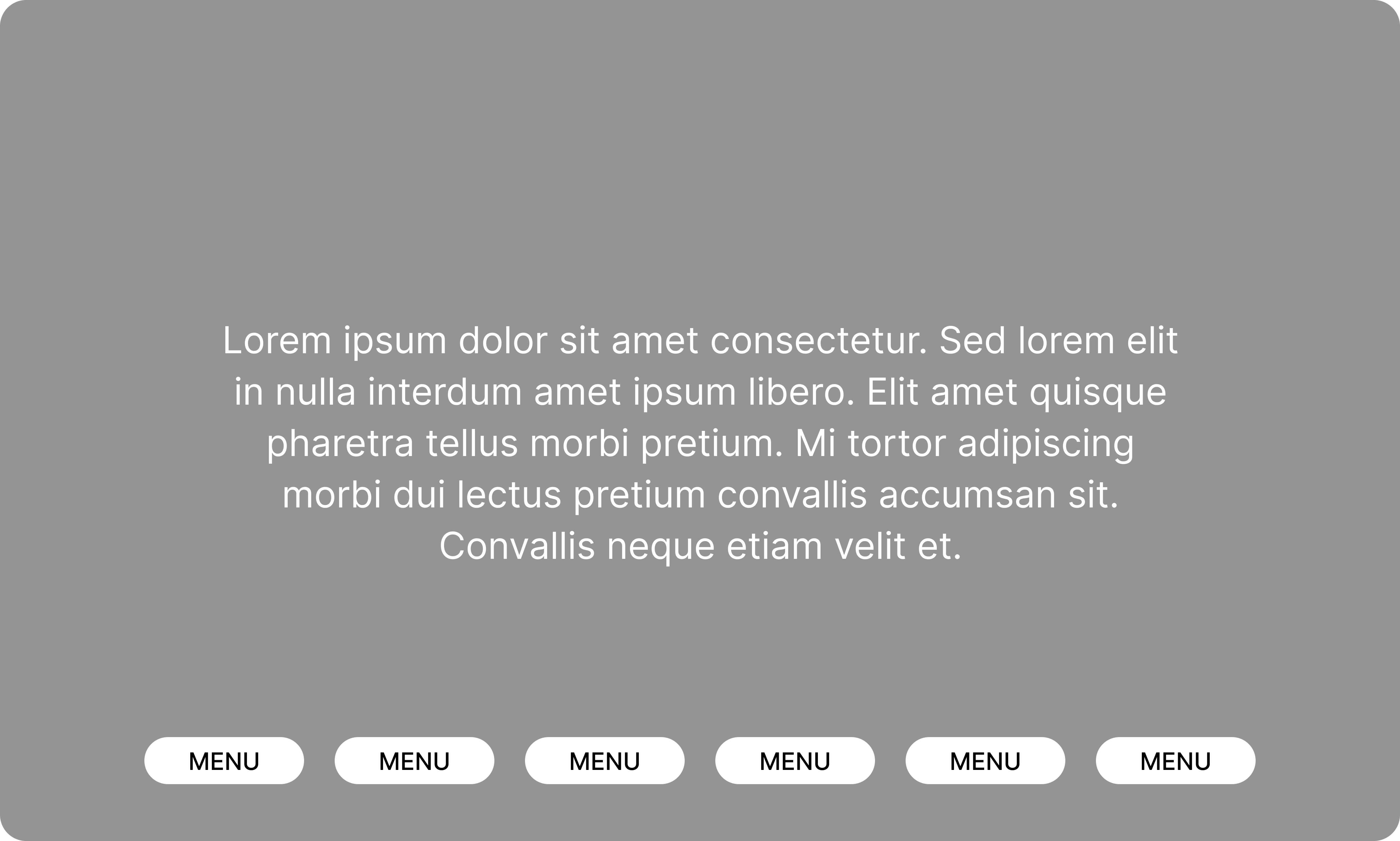
The third-party design followed a traditional vertical flow, stacking building content into scrollable sections.
This approach aligned with familiar web behaviors but fragmented the browsing experience. As users scrolled through multiple sections, they frequently lost track of where they were within the larger development.
Vertical navigation supported content depth, but weakened spatial continuity — a critical factor in multi-building exploration.
My Proposal
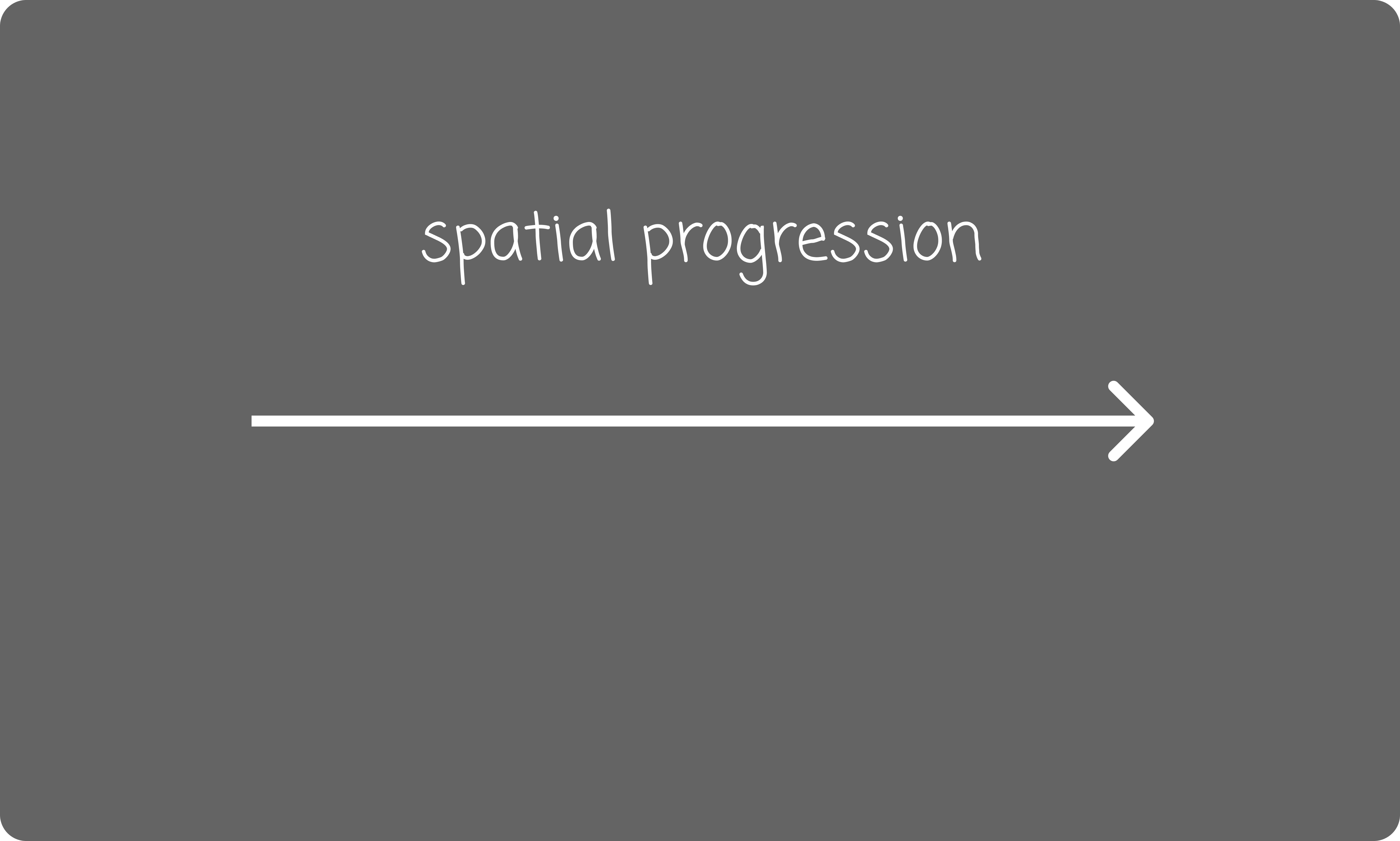
Horizontal Navigation
Instead of stacking content vertically, I proposed a horizontal navigation model that aligned buildings across a single continuous plane.
This approach preserved spatial relationships between buildings and allowed users to transition between them without losing orientation. Navigation became directional rather than hierarchical, supporting natural comparison between locations.
The horizontal model shifted the experience from scrolling through content to moving across space.
Foundation Constraint
All navigation had to live within a single page.
Why This Worked
The design worked because it matched how people actually use the kiosk.
The horizontal navigation model succeeded because it aligned with how users physically interacted with the kiosk environment. Buyers explored the system while standing and speaking with sales representatives, requiring fast recognition, minimal hesitation, and clear spatial continuity. These behavioral realities informed several key design principles that shaped the final structure.
01 — Scanning Behavior
Standing users scan, not read
Buyers interact with the kiosk while standing. A horizontal layout supports quick visual scanning instead of long vertical reading.
02 — Visibility
Fully visible content reduces hesitation
Keeping major navigation elements visible at all times helps users understand where they are without scrolling.
03 — Conversation Support
Navigation supports live conversations
Sales representatives guide buyers in real time. Single-page navigation allows fast transitions without interrupting discussions.
04 — Touch Usability
Large touch targets improve usability
Horizontal grouping enabled larger interactive zones, improving accuracy and comfort on touch-based screens.
Tradeoffs & Risks
No design decision is risk-free — adopting a horizontal model required balancing spatial clarity with technical and usability constraints.
No real design decision is risk-free. While the horizontal model improved spatial clarity, it introduced several technical and usability considerations that required careful balancing.
01 — Content Density
Risk: Horizontal layouts increase visual density.
I introduced strict grouping rules and spacing constraints to preserve visual clarity while maintaining spatial continuity.
02 — Performance
Risk: Slower loading
I prioritized critical content, reduced media weight, and coordinated staged loading strategies with developers to maintain responsive interactions.
03 — Development Complexity
Risk: Custom navigation logic
I standardized navigation behaviors and transitions early, reducing implementation complexity while preserving usability.
04 — Interaction Accuracy
Risk: Touch precision
I designed oversized touch targets and validated spacing to ensure reliable interaction across large-format screens.
Platform Constraints
Interactive map navigation was not supported by the third-party platform.
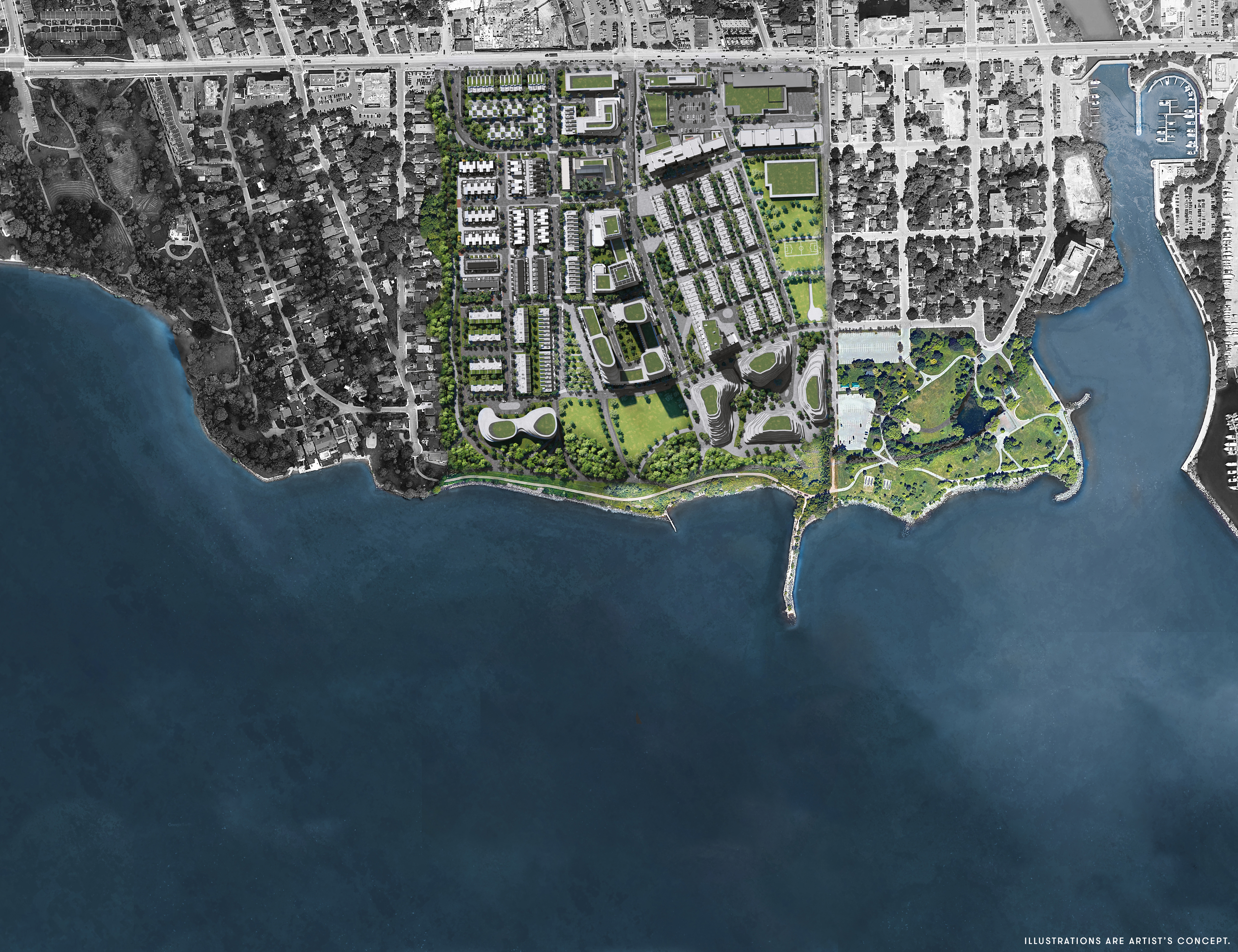
The initial concept included an interactive community map that allowed users to select buildings directly from the master plan. However, the platform supported only static image rendering, preventing dynamic click-based navigation.
To maintain usability, I restructured the experience into dedicated residence pages. This decision directly influenced the site architecture, ensuring each building remained individually accessible while preserving a clear sense of community structure.
Information Architecture
Platform constraints directly shaped the site structure.
Without support for interactive maps, each residence required its own dedicated entry point. I designed a modular site map that allowed users to explore buildings independently while maintaining a cohesive view of the broader community.
Maintaining consistency across five distinct buildings was critical. Buyers needed to move between buildings without relearning the interface.
Information Hierarchy
Community before unit.
The experience begins with an aerial overview of the entire community.
This was intentional.
People don't choose a unit first — they choose a place. The emotional connection to neighbourhood, lifestyle, and surroundings happens before the rational evaluation of floor plans.
By mirroring this natural decision-making sequence, the interface helped buyers feel grounded before comparing specific units.
Outcome
Improving Navigation Confidence.
Following implementation, the redesigned navigation significantly improved how buyers explored the development.
Key behavioral improvements
- Buyers moved between buildings more confidently without needing assistance.
- Sales conversations flowed more naturally without repeated reorientation.
- Users spent more time comparing units across multiple buildings.
The redesigned system reduced hesitation and allowed buyers to focus on evaluating units rather than navigating the interface.
+33%
Increase in daily exploration activity
Buyers navigated across more sections within a single session, indicating stronger engagement.
+23%
Increase in client signups
Improved clarity and confidence supported faster decision-making during sales interactions.
Reflection
Designing Systems, Not Screens.
This project reinforced the importance of designing beyond the screen — considering physical environments, technical constraints, and long-term system scalability. It shifted my focus from building pages to designing structured experiences that support real-world interactions.
01
Designing for Physical Context
Designing for a kiosk environment required understanding how users physically interact with the interface — standing, scanning, and engaging in conversations. This project strengthened my ability to align interface structure with real-world behaviors, not just screen layouts.
02
Thinking in Systems, Not Pages
Moving to a single-page navigation model required careful planning of structure, hierarchy, and scalability. This experience reinforced the value of designing flexible foundations that support future expansion without requiring structural redesign.
Future Improvements
What I Would Improve Next.
Given more time, I would explore:
- Adding spatial previews between buildings to strengthen location awareness
- Introducing personalized filtering to support faster unit discovery
- Conducting longitudinal usability testing to measure decision speed over time