CardPilot
A checkout intelligence engine for multi-card users.
Project
Solo Personal Product Concept
Status
Concept design complete · 2026
Domain
Fintech · Mobile
Role
Product Design · Strategy
Overview
Most people carry multiple credit cards. Very few use the right one at checkout.
CardPilot is a checkout intelligence engine that evaluates every card in your wallet and recommends the best one for each purchase.
The system computes the optimal card in real time and explains the reasoning — in the two seconds before you tap.
Context
Multi-card ownership increases opportunity — and complexity.
The average Canadian credit card holder carries 2.2 cards. Among users who actively optimize rewards, that number rises to 4 or more — each with different earn rates, bonus thresholds, and billing cycles.
Each card has different reward structures, bonus thresholds, due dates, and utilization impact. But issuer apps operate independently. There is no shared state or cross-card intelligence.
The friction happens in seconds at checkout — but the cost compounds over time through missed bonuses, suboptimal rewards, and unnoticed credit utilization.
Research
Three patterns emerged across both expert and casual users.
I conducted 6 informal interviews with Canadian multi-card holders — 3 power users managing 4+ cards with spreadsheet-tracked bonuses, and 3 casual holders who rarely optimized — and reviewed 200+ threads across r/PersonalFinanceCanada and r/CreditCards.
Despite different levels of engagement, users shared the same outcome at checkout:
Experts lack time to calculate.
Casual users don't realize a decision exists.
CardPilot must serve both.
Category Awareness Without Recall
5 of 6 participants could name which card earned best on groceries — but not the actual percentage. At checkout, that gap defaults to habit, not math.
Manual Bonus Tracking
4 of 6 participants tracked welcome bonuses in Apple Notes or a spreadsheet. None were confident in their current progress at the time of the interview.
Invisible Value Loss
When shown a rough calculation of their annual reward gap, 4 of 6 participants expressed surprise. None had estimated it on their own before.
Market Gap
Every fintech app shows you what you spent. None help you decide what to spend with.
Financial tools today are built for reflection — balances, transactions, and spending history.
But checkout is the actual decision moment. No product evaluates multiple cards in real time and recommends the best one at the point of payment. The gap isn't a missing feature — it's a missing category.

Banking apps optimize for account visibility
Balances, transactions, and due dates — but only within a single issuer.

Wallet apps optimize for payment speed
Fast checkout, but no evaluation of rewards, bonuses, or credit impact.

Budgeting apps optimize for spending reflection
Analysis happens after the purchase, not during it.
The project focuses on a narrow question
If a user carries multiple credit cards, how can the system help them confidently choose the best one at checkout?
Hypothesis
This is not a rewards problem. It's a decision problem.
Users don't default to habit because they lack data. They default because four variables must be evaluated simultaneously — reward rate, bonus progress, utilization impact, and payment timing.
Existing tools expose the data. None compute the decision.
The core assumption being tested
If the cognitive load of multi-card selection is reduced from evaluating 4 variables to receiving 1 recommendation, users will follow the optimal card more often at checkout.
System Architecture
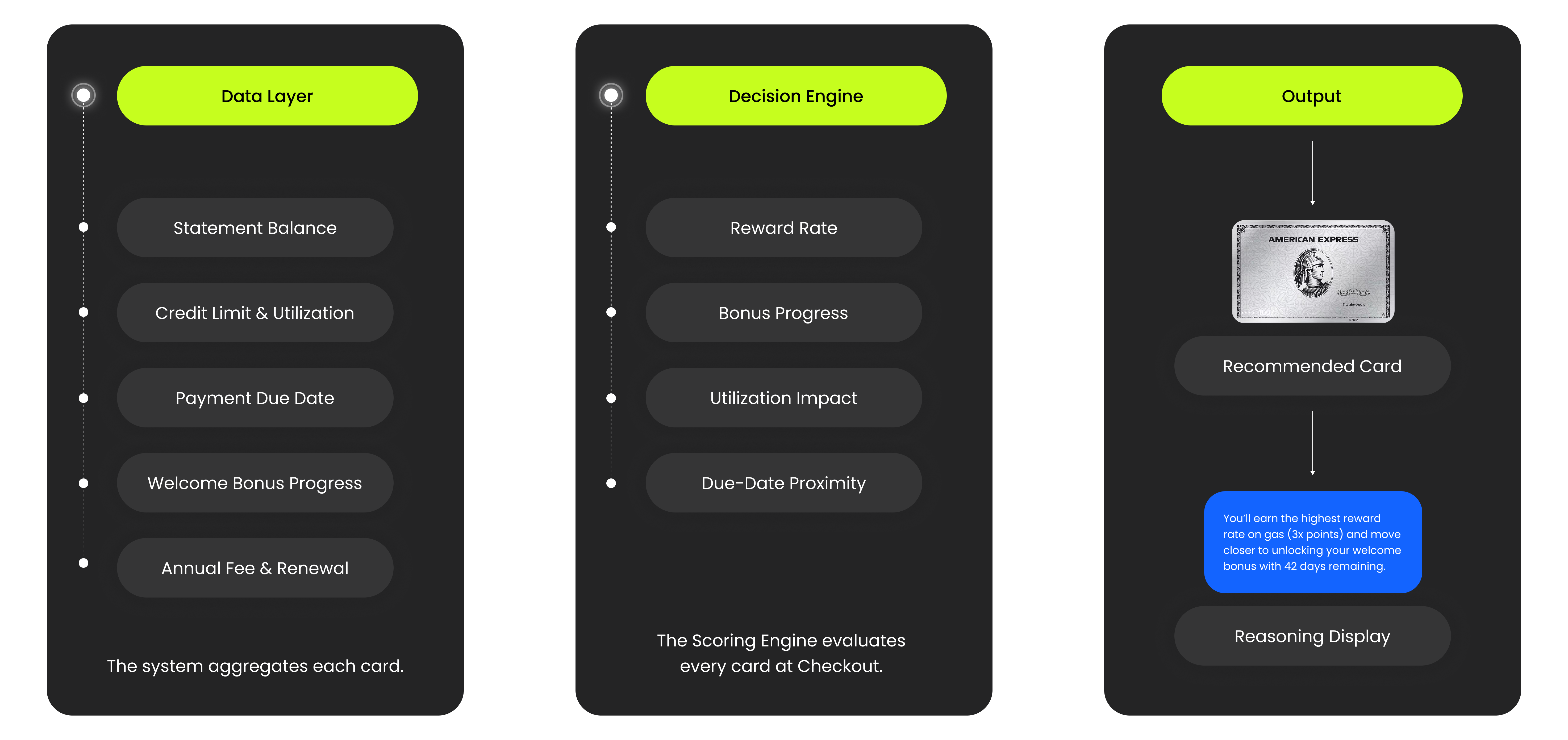
Layer 1 - Card Management Foundation
CardPilot aggregates structured data for each card:
- statement balance
- credit limit
- utilization
- payment due date
- welcome bonus progress
- annual fee lifecycle
This creates a unified card state across issuers. Without this layer, recommendations would rely on guesswork.
Layer 2 - Checkout Intelligence Engine
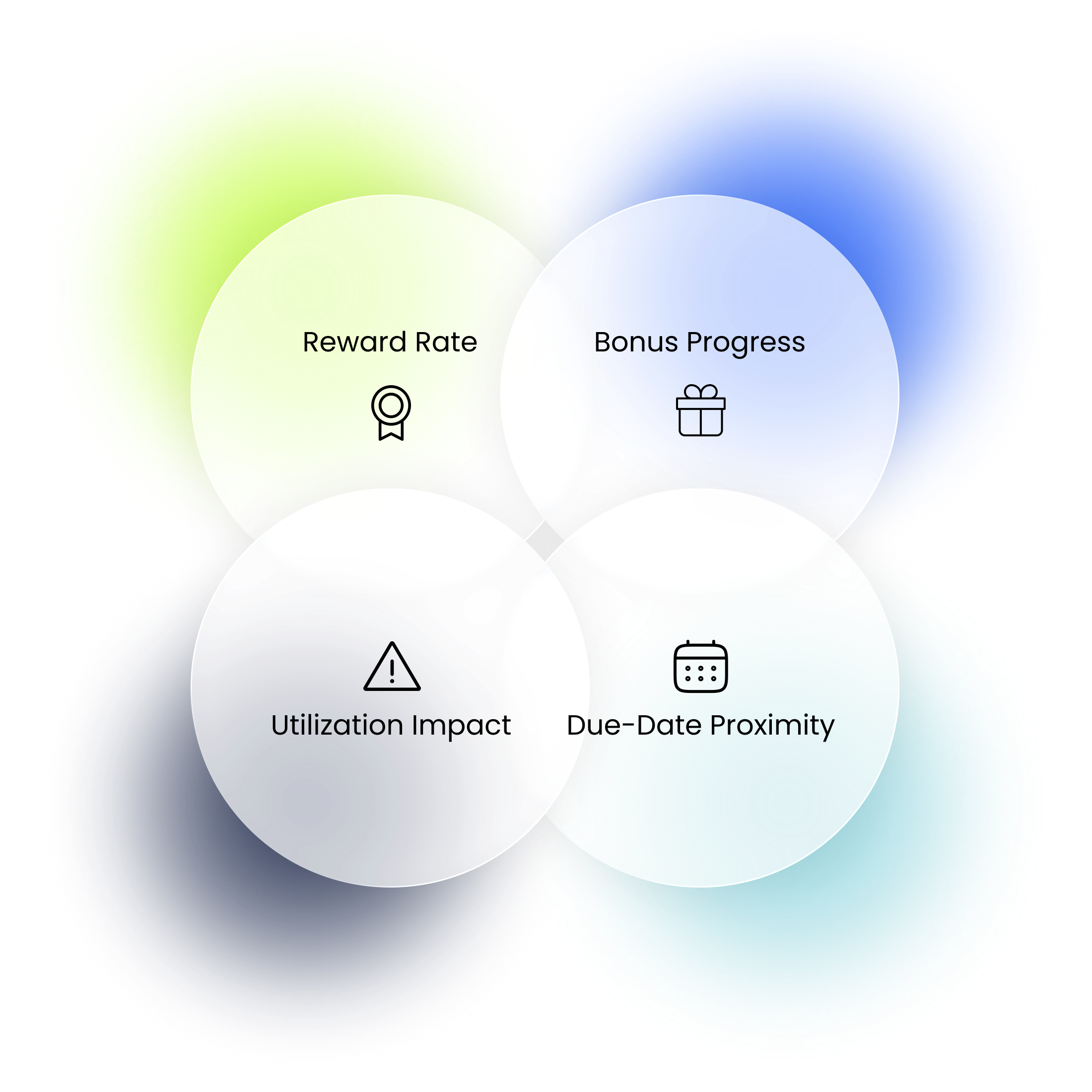
At checkout, each card is evaluated across four signals:
- reward rate
- bonus progress
- utilization impact
- due-date proximity
The engine balances reward upside with financial health, and the highest-scoring card becomes the recommendation.
CardPilot Decision System
Onboarding
Trust before intelligence.
CardPilot depends on accurate card data, which requires users to grant financial access during onboarding. Because permission introduces friction, the flow prioritizes clarity before access — explaining value, defining what data can and cannot be read, and making consent reversible.
Card data is synchronized through secure financial integrations, allowing recommendations to update automatically as merchant context changes.
Checkout
One recommendation. Two signals. A decision in two seconds.
When a merchant is detected, the engine ranks every card simultaneously. Instead of showing a comparison table, CardPilot surfaces one recommendation with two supporting signals.
The model evaluates four dimensions internally — but exposing all four would recreate the same cognitive overload the product is designed to remove.
Two signals provide enough transparency to trust the recommendation, and enough context to override it. If two cards score identically, CardPilot defaults to the user's primary card.
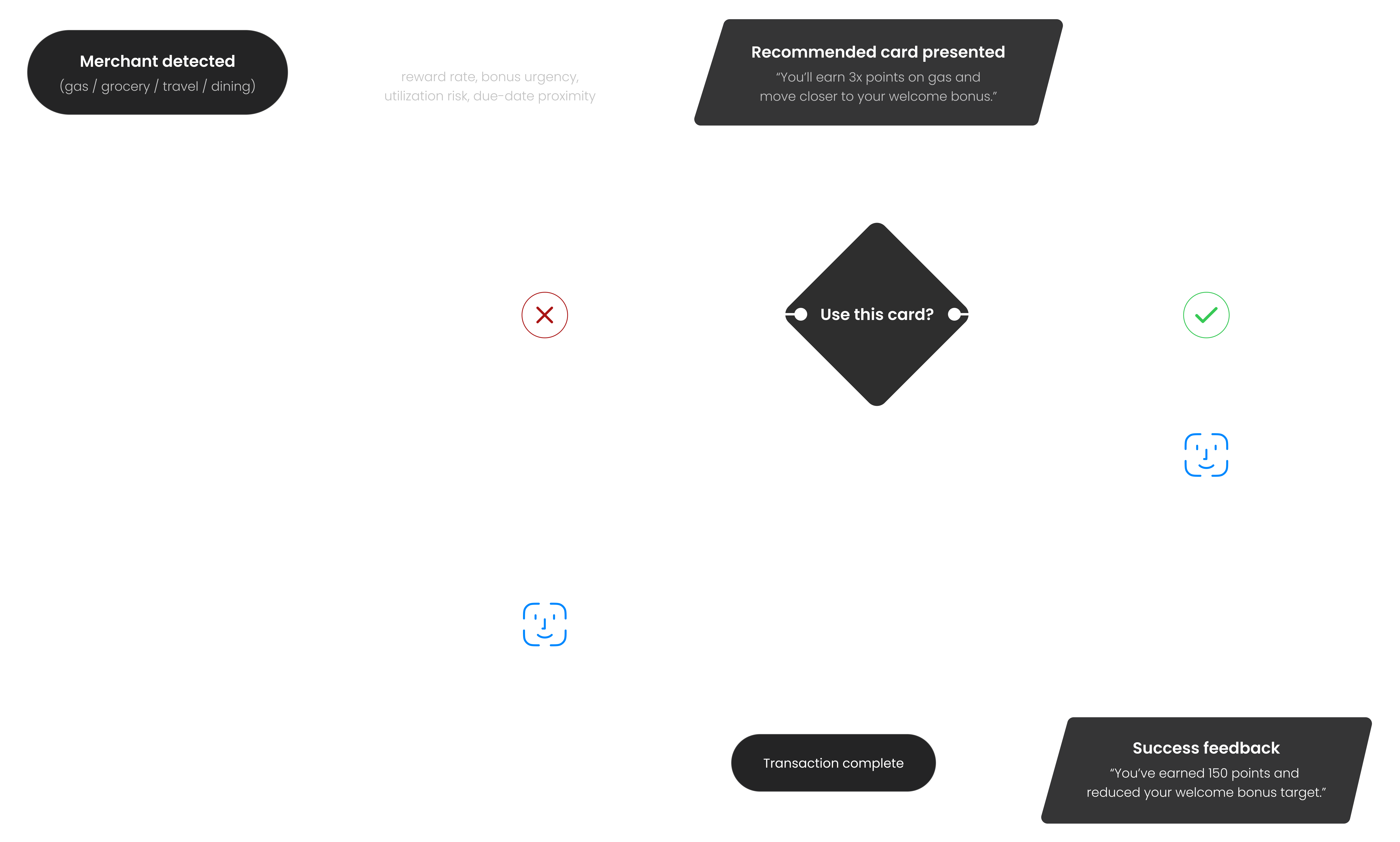
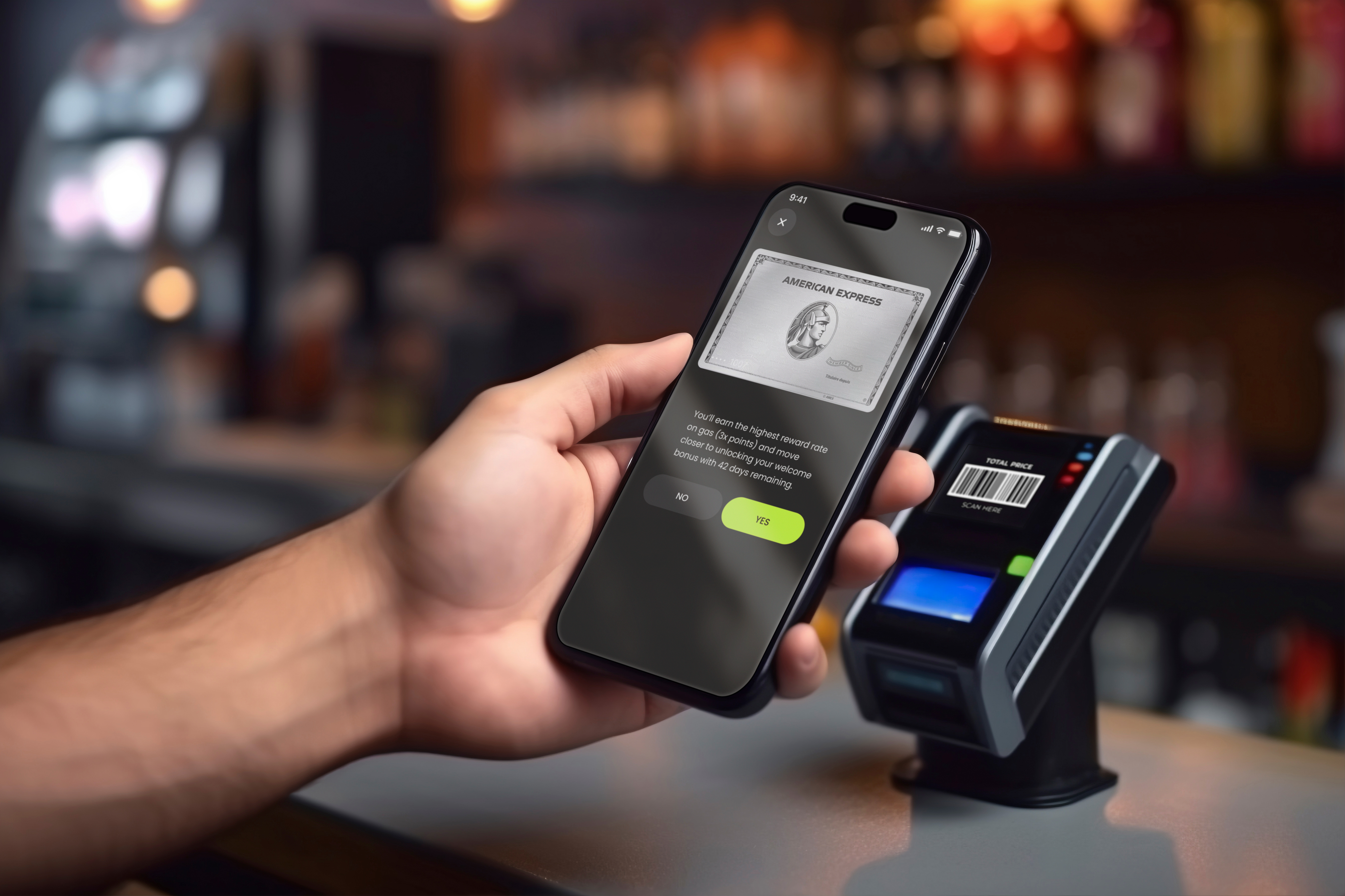
Gas Station Checkout Example
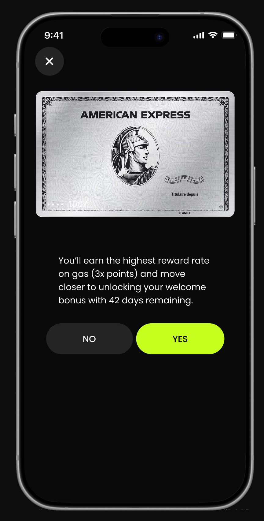
At checkout, CardPilot surfaces one recommendation supported by the two most decision-relevant signals.
In this case:
- Highest reward rate on gas (3× points)
- Progress toward welcome bonus (42 days remaining)
These signals explain why this card is recommended — without exposing the full scoring model.
Design Decision
Every screen is the result of a decision, not a preference.
CardPilot intentionally avoids the visual language of traditional banking apps. Most fintech interfaces rely on blue and white palettes designed to signal safety.
CardPilot is a decision tool, not a banking interface. The design language emphasizes precision and clarity — deep black surfaces, high-contrast typography, neon yellow-green for primary actions.
The Pay Flow
The card stack home screen surfaces alerts directly on the card — "Payment due in 3 days" appears on the card it belongs to, not buried in notifications.
The pay flow closes the loop. The success screen shows exactly what the transaction earned and how it moved the welcome bonus target.
Card detail — distinguishing monitoring data from reference data
Each card screen separates information by urgency.
Current balance, due date, and utilization are monitoring data — surfaced prominently.
Annual fee and renewal date are reference data — visible but visually quieter.
Welcome bonus progress appears only when a bonus is active, keeping the interface uncluttered for cards without one.
Business Model
Revenue exists outside the decision.
CardPilot generates revenue without interfering with the recommendation engine.
Monetization happens around the system — not inside it.
Partner Offers
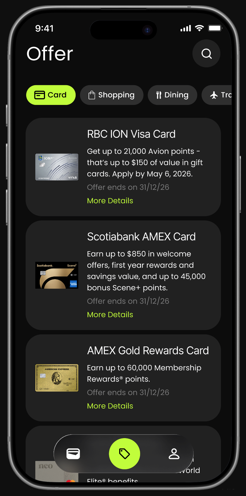
Financial institutions can surface optional offers in the Offers tab.
Examples include:
- New credit card applications
- Upgrade opportunities
- Limited-time welcome bonuses
Partners pay CardPilot in two ways:
- Referral fees when users apply for a card
- Sponsored placement fees to feature offers within the Offers tab
These placements remain separate from checkout recommendations.
Recommendations are never influenced by commercial incentives.
Transaction Partnerships
At scale, CardPilot may participate in transaction-level partnerships with issuing banks.
Under this model, the system receives a small percentage of supported transactions.
This represents long-term infrastructure revenue — not an early dependency.
Product Principle
Trust is architectural. If users believe recommendations are influenced by commercial incentives, the product loses credibility — and the recommendation engine becomes meaningless.
Design Tradeoff
Balancing transparency with decision clarity.
Early concepts surfaced the full scoring model — all four signals. While technically transparent, this recreated the same cognitive load the product was designed to remove.
I showed both versions to 3 participants. All 3 said the four-signal version felt like "more homework." The two-signal version felt "faster to trust."
The final design simplified to one recommendation supported by two signals — the most decision-relevant ones for that specific transaction. The system evaluates all four internally. Users only see what they need to act.
The tradeoff: reduced transparency for increased usability. The bet is that consistent, accurate recommendations build more trust over time than a visible scoring model.
Measuring Success
Evaluating whether the system improves decision confidence.
If CardPilot were launched, success would be measured through behavioral signals in the first 90 days — with a north star of reducing the gap between the card users choose and the card they should have chosen.
Recommendation adoption rate
Target: >65% within 90 days of onboarding. Estimated baseline: 20–30% (typical fintech feature adoption). The gap between adopted and ignored recommendations is the signal — high ignore rate suggests the model doesn't match user context.
Decision time at checkout
Target: median under 4 seconds from recommendation appearance to payment confirmation. Estimated current baseline for a deliberate multi-card user: 8–12 seconds. Time reduction without regret is the goal.
Reward capture rate
Target: 15–20% increase in estimated annual reward value versus pre-CardPilot baseline. Measured by comparing the card chosen to the optimal card for that transaction category and spend amount.
Reflection
What I'd do differently — and what's still unresolved.
The hardest design decision in CardPilot wasn't the visual language or the checkout flow — it was deciding when the system should stay silent.
A recommendation engine that always recommends can create its own kind of noise. I didn't fully solve that problem, and I'd make it a first-order constraint in the next iteration.
I'd test silence as a feature
What happens when no card is meaningfully better than another? The current design defaults to the primary card — but there may be more value in saying 'they're equal' explicitly. That's a trust moment I didn't design for.
The two-signal approach needs real validation
I simplified to two signals based on intuition and 3 informal conversations. A proper A/B test comparing 2 vs 4 signals would be the first thing I'd run with a real product team and user base.
Onboarding is underdesigned
CardPilot's value depends entirely on accurate, up-to-date card data. I didn't fully solve how users add and maintain that data without it becoming a chore — which is probably the product's biggest adoption risk.