WeGo
A group trip planning app that treats the trip as a shared object.
Project
UX Scene Designathon 2022
Result
Best in Design · 38 teams
Timeline
48 hours
Domain
Mobile · Travel
Role
Lead UX Designer · Lead UI Designer · Researcher
Team
Matilda Luo, Laura Pedraza, Sandy Zhang
Overview
WeGo is a mobile app for group travel planning. It replaces scattered tools like WhatsApp, Google Docs, Splitwise, and Google Maps with a single shared trip object — one place where the group makes decisions together, tracks expenses in real time, and stays aligned from planning to post-trip.
Most teams at the designathon focused on designing a single feature. The real problem wasn't a missing feature — it was that no existing tool treated the trip as something the group owned together. Solving that required designing a system.
Context
38 teams. Same brief. Most designed a feature. I designed a system.
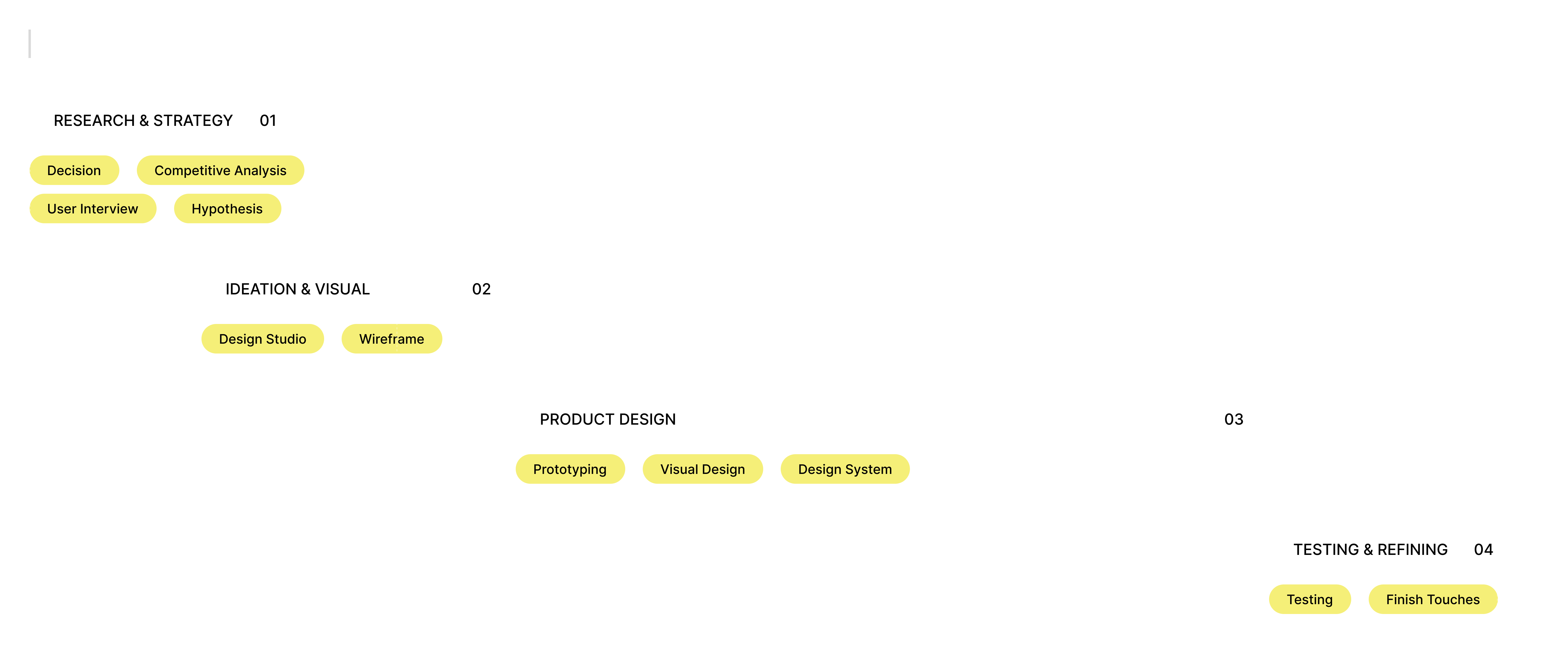
UX Scene Designathon gave every team the same challenge: design a complete solution in 48 hours.
The biggest risk wasn't lack of ideas — it was losing time to unfocused research, endless ideation, or slow handoffs between wireframes and visual design. Before research began, I structured the sprint into four phases with clear outputs and exit criteria. This kept the team aligned and prevented drift when the pressure was highest.
Constraint
We lost a team member before research even started. That shaped everything.
Four hours in, one of our four team members dropped out. We went from four designers to three with 44 hours left.
My immediate decision was to re-scope the product, not redistribute the same workload. We held a 15-minute alignment session to define what was essential, what was optional, and what had to go entirely.
Those boundaries shaped every decision that followed — the research we ran, the features we built, and the cuts we made.
Key Insight
Constraint didn't limit the product. It focused it.
Research
Users weren't missing tools. They were missing a shared source of truth.
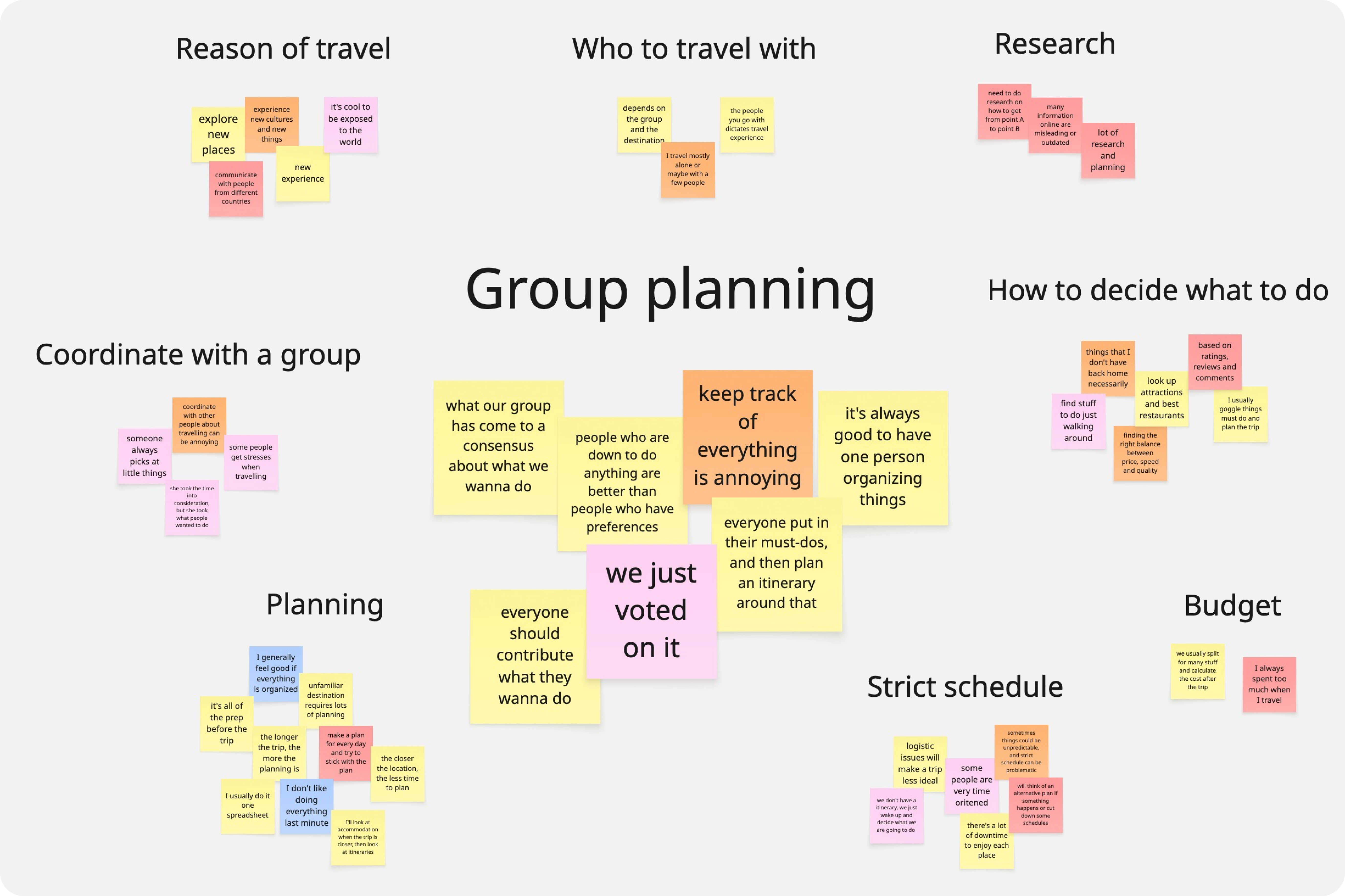
We ran five interviews with experienced group travelers and conducted a competitive audit of TripIt, Wanderlog, and Splitwise. Given the 48-hour constraint, I prioritized depth over breadth.
Four patterns emerged:
- planning was fragmented across 3–5 apps
- decision-making created the most friction
- expense anxiety existed throughout the trip, not just at settlement
- no tool treated the trip as a shared object owned by the group
Affinity mapping surfaced three design priorities:
- 1.real-time visibility into group decisions
- 2.low-friction input from every member
- 3.continuously visible financial data
These priorities guided every major design decision that followed.
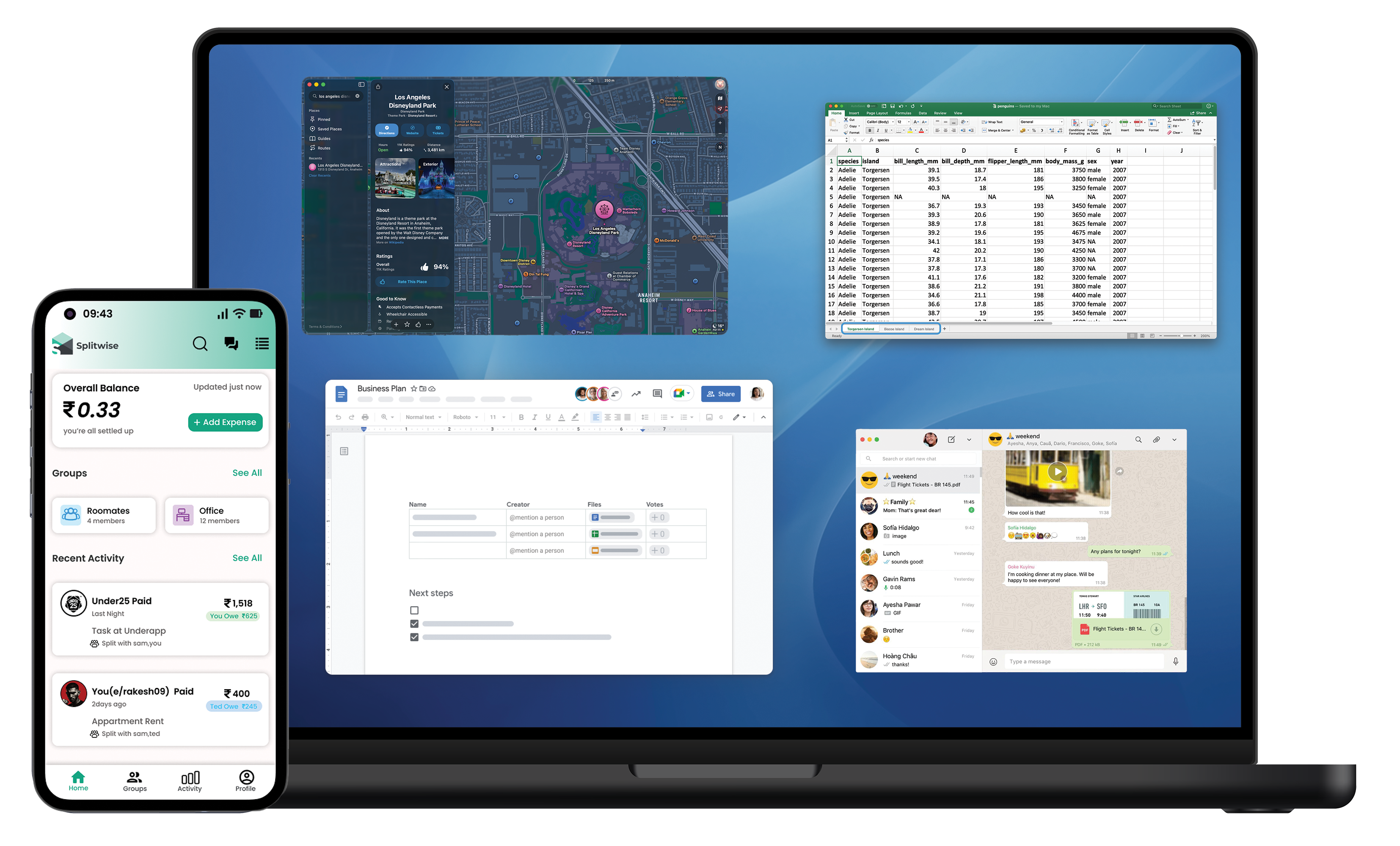
No single tool treats the trip as a shared object.
Trip planning is scattered across WhatsApp, Google Docs, Splitwise, and Google Maps. None share state. Each tool solves a piece of the problem but none support the trip as a shared object.
Thus:
- coordination falls to the most organized person
- decisions happen by default rather than by choice
- expenses create anxiety because totals are invisible
The group loses momentum every time someone switches apps to find basic information.
How Might We
Design a single, coherent experience that helps a group make decision together, stay aligned throughout a trip, and reduce the cognitive overhead of coordination at every stage?
Decision
The interesting problems were structural, not visual.
Three system-level challenges shaped every major design decision in the product.
Scope
What we cut made the product stronger.
Three features were intentionally removed — not because of time, but because including them would have changed the product.
In-app Text Chat
The problem wasn't missing chat — it was the absence of a shared source of truth beside it. Adding another message thread would only increase fragmentation. Audio chat was kept because it enables conversation without creating persistent threads.
Map Exploration
Users didn't struggle to find options. They struggled to decide together. Discovery wasn't the bottleneck — decision-making was.
Social Trip Sharing
This would shift WeGo from a coordination tool to a social platform — requiring a fundamentally different product to build and maintain.
Final Product
Four features. One product. No context switching.
WeGo organizes planning, decisions, spending, and memories around a single shared trip object. The challenge wasn't designing each feature individually — it was making them feel like parts of the same system.
The judges later cited the coherence of this multi-feature experience — a direct result of the structural decisions made in the first hour.
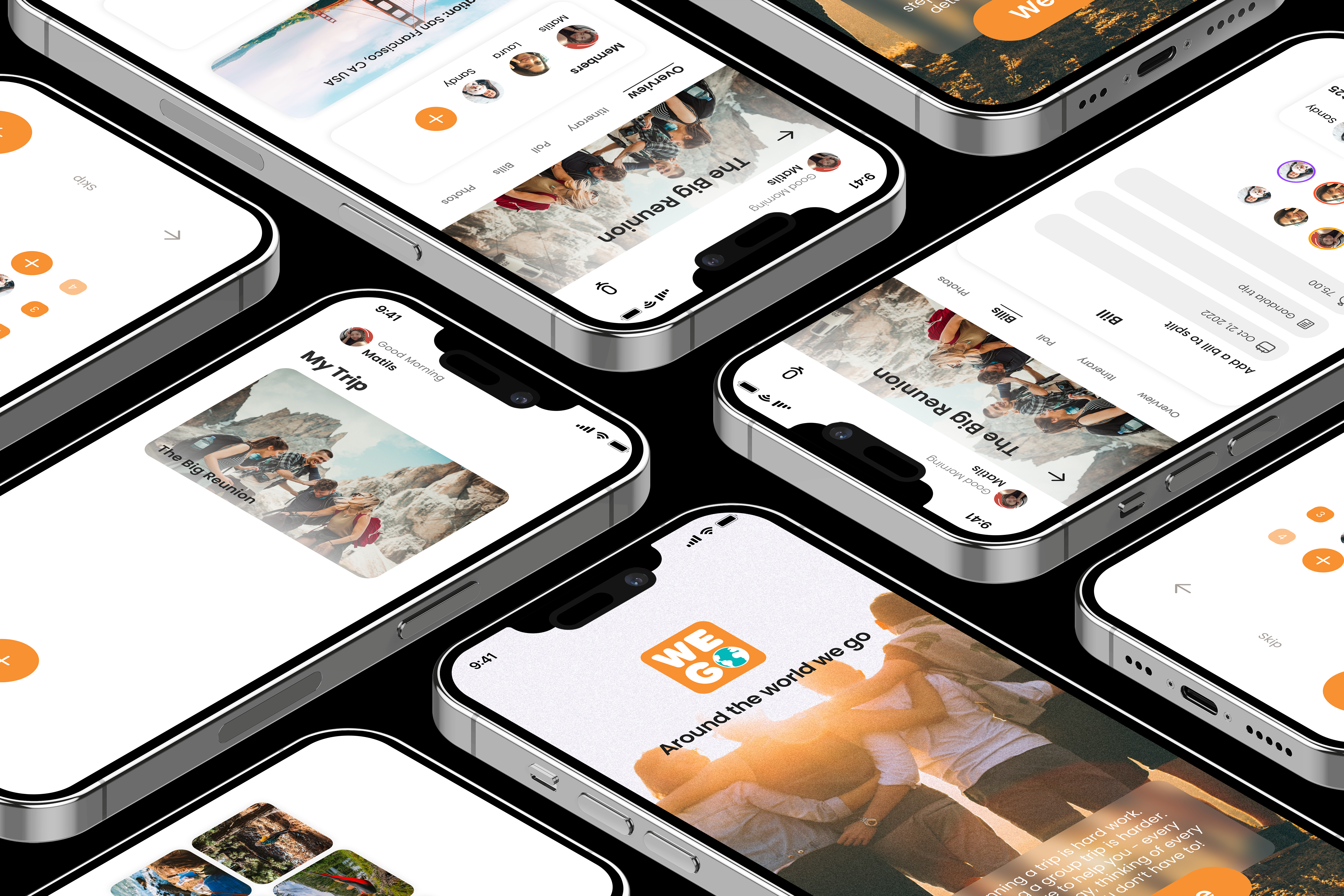
Onboarding
The trip begins with creation and invitation. The trip creator sets the destination and dates, then invites members through a shared link. Once joined, every traveler enters the same trip space, where plans, decisions, and expenses are visible to everyone from the start.
Overview
The trip overview acts as the group's shared control panel. Members, destination, dates, accommodation, and transportation live in one place, so every traveler sees the same plan.
Audio Chat
Audio chat lets the group discuss options without leaving the planning space. The call lives inside the trip and ends cleanly once the decision is made — no persistent threads to scroll through.
Itinerary
Activities are organized by day using a date-tab layout. Each entry links to navigation and details, making the plan easy to scan — which day, which activity, how to get there.
Poll
Polls allow any member to propose options and the group to vote in real time. Once a decision is made, the result flows directly into the itinerary.
Bills
Expenses are recorded as they happen — who paid and how the cost is split. The running balance stays visible throughout the trip, so there are no surprises at settlement.
Photos
Photos live inside the same trip space used for planning, keeping memories tied to the shared trip rather than scattered across messaging apps.
Reflection
What the judges saw was a direct output of every decision above.
WeGo won Best in Design out of 38 teams. Judges highlighted the coherence of the multi-feature experience, information hierarchy, and visual polish. Those outcomes weren't accidental — they were the result of early framing decisions and disciplined scope management.
Time structure is a design decision
Mapping the 48-hour sprint into four phases with clear exit conditions kept the team focused under pressure. Structure isn't overhead — it's what makes speed possible.
Scope discipline is a leadership skill
Re-scoping the product instead of redistributing work kept the experience coherent. Knowing what to remove is often more important than knowing what to add.